Your Cart is Empty
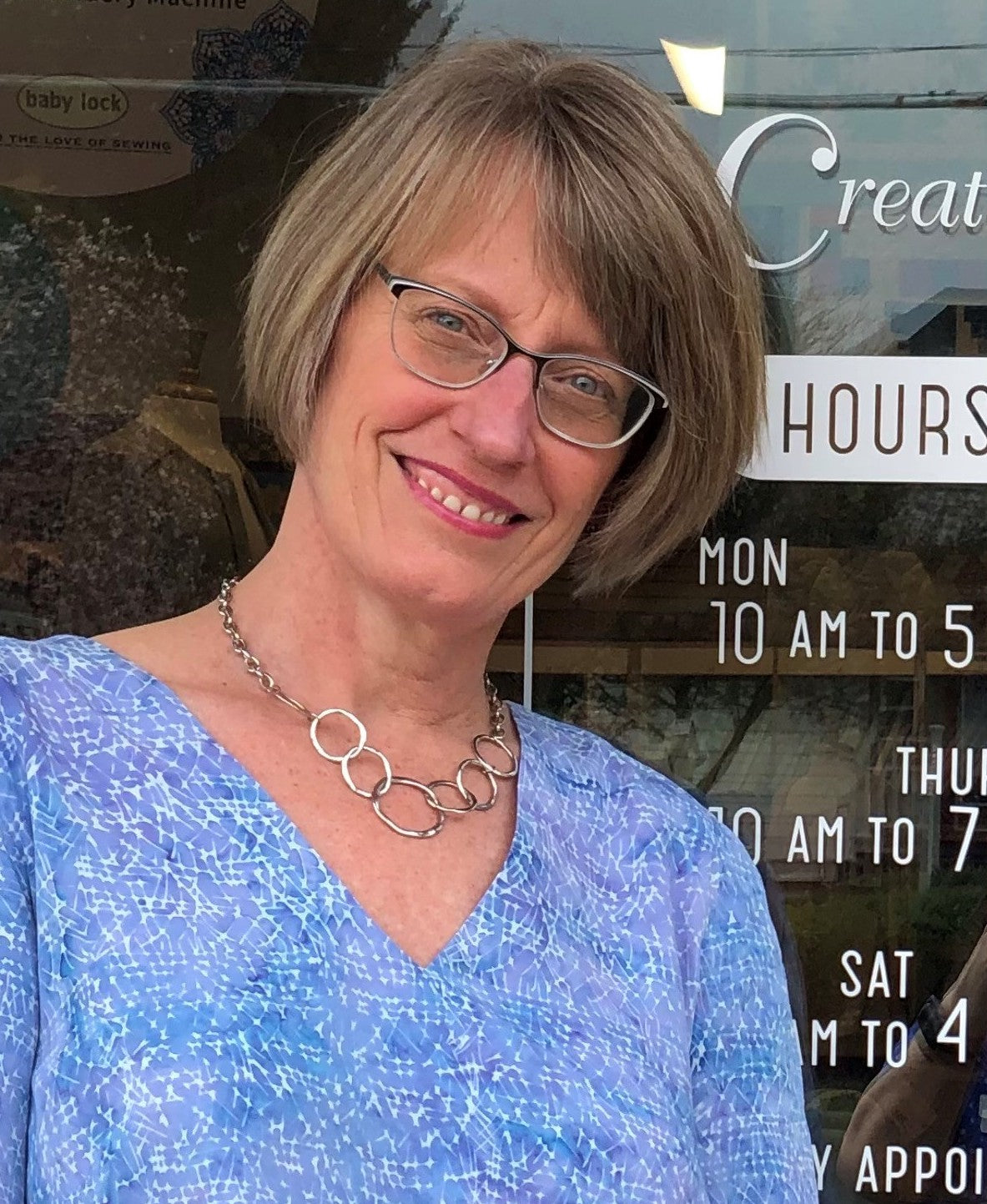
Meet Light Summer, Lisa Swisher. Lisa and I met each other years ago watching our son's play baseball. We were always interested in each other's businesses so I welcomed the opportunity to speak about color harmony at an event at her fabric shop, Sew Creative in Fairport, NY. The audience attendees were primarily experienced sewing enthusiasts who made their own clothing.
Sew Creative is an excellent setting for a discussion about color harmony because the shop is filled with gorgeous colorful fabrics surrounded by beautiful quilts, table cloths, clothing and other creative projects that provided the perfect visual in explaining the difference between a masterpiece and one that doesn't quite work.
When you spend the time to create your own clothing, it is particularly important to ensure that you get the right colors, styles and understand the science.
I have been working with color my entire career. As the owner of Sew Creative, I am constantly dealing with color in both merchandising and product selection. Back in the 80’s my mother also did color analysis for our customers. Does anyone remember Color Me Beautiful?
Carole Jackson's Color Me Beautiful and her home-based 4 season color analysis system were a 1980's pop-culture phenomenon. We have Color Me Beautiful to thank for bringing personal color analysis to the mainstream. Because it was over simplified into a 4 season system and structured to accommodate home parties and quick determination of a season, it made personal color analysis a frivolous trend.
Professional color consultants are still overcoming that stigma and the misleading information cultivated decades ago. Many people, including me, struggled to figure out what colors suited us until discovering the more fine tuned 12 season personal color analysis system based on Albert Munsell's color theories.
Lisa and I had typical experiences in the 4 season color system. She was told she was a Summer and I was told I was a Spring. The colors were close but just didn't give the magic of our Light Summer seasonal tone which falls between Summer and Spring. For her, the Summer colors from the 1980's were just a bit too muted and cool. For me, the Spring colors were too bright and warm. With the 12 color season system we now have the perfect balance of all 3 dimensions - light, cool and soft.
When I came to Kerry’s studio with our group to have our colors done I had an idea that I would be in the summer range. I was amazed at how precisely Kerry was able to define our color palettes. It was really an exciting experience. It really is empowering to know what color will be the most flattering and I always get compliments on what I am wearing when it is in my palette.
I am now much more conscious of choosing fabrics for the shop in a wide range to allow all of the seasons to find something that will appeal to them. I really enjoy watching my customers wandering through the fabrics and seeing what colors they are drawn to whether it is for a garment they want to make or a quilt they are imagining.
Sew Creative offers a wide variety of classes and special events in addition to fabrics, notions and equipment.
Read about other's colorful journeys in these recent blog posts!
Financial Wellness and Harmony Advisor, Light Spring, Erica Cummings
Capsule Wardrobe Specialist, Warm Spring, Andrea Bonawitz
Personal Stylist, Bright Spring, Kelly McCarthy
Community Educator, Bright Winter, Danielle Raymo
Comments will be approved before showing up.

I had the pleasure of working with a Cool Winter client whose colors I had done many years ago. She had tried to shop for her colors but wasn't really motivated to stay true to them until more recently when she brought her daughter in for a color analysis and remembered the WOW when seeing someone draped in the perfect shades. Enjoy reading Julie's experience immediately following the closet color refresh and taking advice from Kerry about putting together outfits in a new way.

I am thrilled to introduce you to my friend, colleague and dreamwork mentor, Warm Spring Kristina Hutch Matthews. Kristina is an artist, writer, animal lover, healing arts practitioner and so much more! Her mother is also an accomplished and prolific artist and together they run the Penfield Arts Center.
We immediately clicked when we met and I was excited to give her a color analysis given her natural talent for all things aesthetic. I wasn't surprised to see her closet immediately following the analysis was filled with muted colors. That is typical these days, especially for those with a creative style. But, I was shocked to see her closet a few months ago. She has completely transformed it from the dusty colors of the past to lighter and brighter colors focused especially on the warmth of Warm Spring. She has learned that the golden browns of her hair and eyes work perfectly as neutrals replacing blacks and grays.
Over the years, I have utilized many personal development tools but it was Kristina's dreamwork class that has given me the most incredible AHA moments. I thought the class would be fun and interesting and help me understand why I saw a whale or something like that but dreamwork is so much more!! Kristina has a talent for giving feedback and fresh insight into a situation that may be challenging or lingering from the past. My understanding of how to remember and process dreams has truly been life changing and transformative. Kristina has brought so much color into my life! Read more about her journey with her artistry and healing practices as well as her personal color journey in this month's blog:

What fun to introduce the incredibly colorful Bright Spring, Natalie Rae Dickerson! I met Natalie when she was in the process of taking over the fabulous fine clothing store, Panache Consignment from my client and colleague Joan Lincoln. Meeting Natalie was like a burst of fresh air. She radiated warmth and vibrancy and was very game to learn more about what colors would be ideal for her. It was no surprise that she absolutely popped in the bright colors and that she jumped right in head first into wearing them. Every time I pop in to the shop, she is shining in some new combination of her colors. She redesigned the store to be organized by color and I find it so easy to find colors for myself and my clients. Read more about her international journey in the world of fashion and color in this month's blog.
Would you like to receive updates about Indigo Tones products, services, travel schedule and interesting features on color? Subscribe today!