Your Cart is Empty
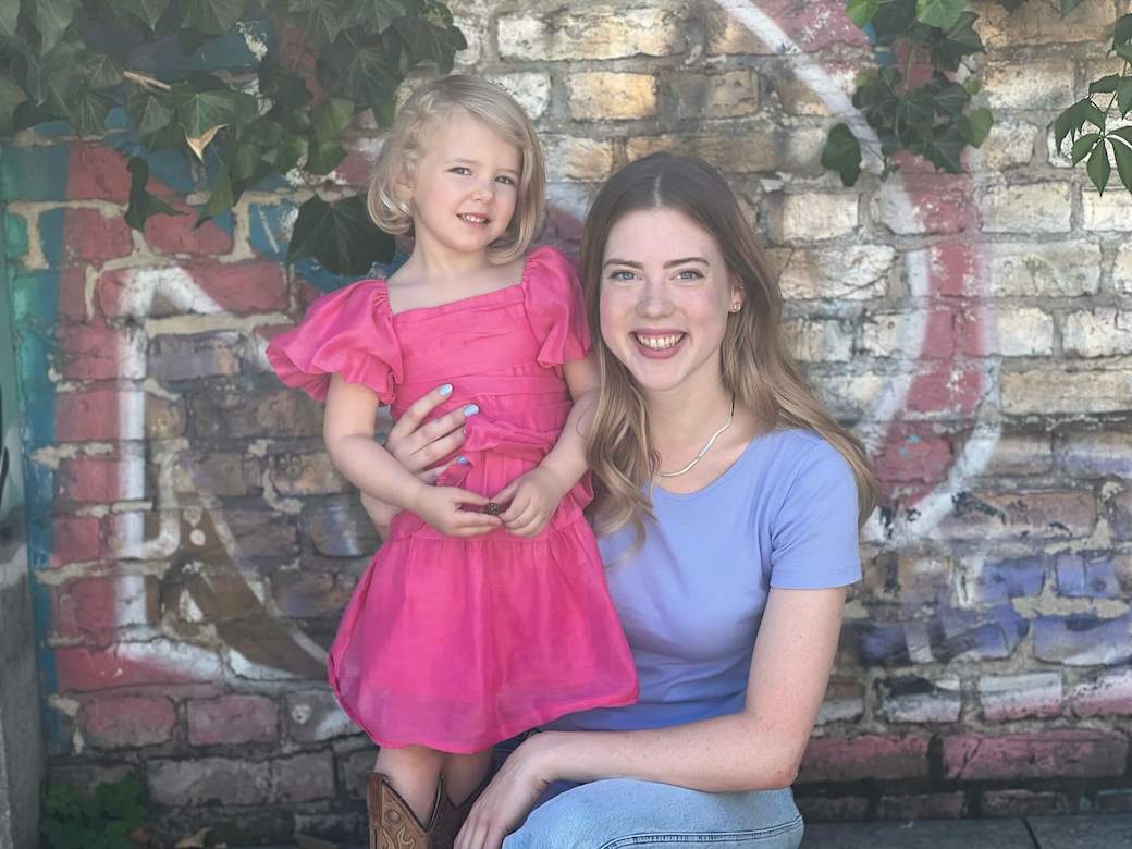
What fun to introduce Cool Summer, Genevieve Van Voorhis. Gen is an American who has been living in Berlin for many years and recently founded her own nanny service, Lighthouse Nanny specializing in English speaking nannies and babysitters.
She put together a wardrobe in a large international city where black is the preferred color choice and her business demands that her clothing must be casual, comfortable and simple when interacting with children.
Gen was a childhood friend of my daughters and one of the first to allow me to experiment with draping when I started doing color analysis. My initial set of Soft Autumn test drapes had lots of soft blues and greens and it created much confusion (my current soft autumn drapes are mostly browns, salmons and earth tones better reflecting the nature of that palette). I mistakenly told her she was a Soft Autumn. As I learned more, I realized that she was likely not a Soft Autumn but by then her life had taken her off to college out of state and then off traveling all over the globe.
Several years later after much begging we were finally able to meet again and confirm that she was not a Soft Autumn but actually a Cool Summer! An incorrect color analysis is one of my worst nightmares and I have always worked really hard to be certain that this doesn’t happen. The affects can be long lasting and traumatic so I was thrilled to get things updated and so how Gen has now taken to her colors!
The good news is that after some adjustment, Gen is now fully enjoying the joys of wearing colors that are more perfectly harmonious. Her coloring is actually the essence of the Cool Summer season - soft, muted medium brown hair that lightens slightly in the summer, large round blue eyes and cool porcelain skin.
Enjoy reading more about her journey with her colors in this month’s colorful lives blog:
Growing up with Kerry’s daughter Clare, I always knew that the world of color harmony existed. Whenever I visited Kerry’s home and studio, I was mesmerized by the flowing swatches, and the different color families they represented. I didn’t need any convincing that wearing “the right colors” made a huge difference in the way a person looked.

Kerry was kind enough to gift me my own color analysis. I was beyond excited about the results: I was a Soft Autumn! How perfect—September, my favorite month of my favorite season. Just-turned fall leaves, warm cups of coffee, brown leather boots.Thiswas the color palette for me.

Without hesitating, I purged my wardrobe, jewelry, makeup and even shoes. I scoured stores for rich mustard, deep cranberry, forest green and all the dusty earth tones I could find. It was easy—I loved the colors, and sure enough, other people did too.
“Wow, what a beautiful sweater!” and “Such a pretty shade you’re wearing!”
The compliments were rolling in, and I never looked back. That is, not until a few years later, when Kerry told me that she understood color harmony much better and wanted to take another crack at my colors. Back in her studio, Kerry confidently fanned her swatches out once more. It didn’t take long to confirm what she’d already suspected. I wasn’t a Soft Autumn. I wasn’t even an autumn. I was a Cool Summer. Light blues like the sky on a cloudless day. Pale, light lavender and sweet baby pink. Pretty colors in a postcard maybe, or at a baby shower—but not exactly my taste.

Worst of all, everything I wore was now supposed to be cool, which rendered all my brown leather accessories and gold jewelry utterly useless.
Shortly after that, I moved to Berlin, Germany. Moving abroad meant once again purging most of my clothing and possessions down to just one suitcase.
When I arrived in Germany, I focused on fitting in. If Berlin had a color palette of its own, it would probably be called Gray Winter, or Chaotic Summer. The Berlin uniform is head-to-toe black. Maybe a few white t-shirts, or some blue denim. The occasional pop of neon. Definitely not the raspberry pinks and lively turquoise of Cool Summer.
Consciously or unconsciously, I tucked my palette in the back of a drawer and stopped thinking about it too much. I wore black turtlenecks with reckless abandon, and mixed and matched shades of metal like there was no tomorrow.
That is until I came home for a visit with Clare and Kerry. While talking about colors and clothing, Kerry noted that I wasn’t wearing my cool summer colors and asked me about it. Guiltily, I replied that I’d more or less ignored my palette for the last few years, since I found the Cool Summer colors to be—ironically—“uncool".

I couldn’t part with my black-on-black ensembles, or black shoes and sunglasses. Any colors I did work into my outfits were usually dark, dusty, and muted. But I did have to admit—no one seemed to comment on the shades and colors of my outfit anymore.
Kerry pointed out that even the Cool Summer palette had more neutral options—whites and creamy grays instead of harsh black. She suggested I just pick a few colors I could stand, and try and work them where I could. She also pointed out the colors that were washing me out the most—black, and all these dark dusty colors I was so fond of.

She also reminded me exactly what it is about my palette that works with me—the cool tones that highlight the blue in my eyes, the light colors that make my pale skin seem more vibrant. I had to admit—she was right.
After that, I took a new approach to color harmony. I did not run home and immediately dump everything that wasn’t Cool Summer. Instead, I just did as Kerry said. Trying to substitute white or gray for black where I could, and selecting two light colors I could get behind: a pale blue and pale purple. These were the only new colors I let into my clothing. With accessories, I was a tiny bit bolder, adding a pale yellow baseball cap here, a light pink hair clip there.

Slowly, I started to swap black leather boots for clean, white sneakers. Instead of black trousers, I try and opt for tailored blue jeans. I introduced new go-to pieces of silver jewelry and over time, found it easier to say goodbye to most of the clothes and accessories that weren’t from the Cool Summer palette. It’s not that my taste changed—it’s just that I found ways to fit those colors to my taste.
While looking at my open swatch book might make me a little queasy from all the light colors together, that doesn’t mean I have to wear them all at once. Or even at all. Simplifying my wardrobe around just a few colors has made dressing and accessorizing exponentially easier—and I feel more confident in just about everything I put on.

It’s also made my wardrobe more sustainable. Instead of being tempted into buying every fast fashion item that catches my eye, I use my palette as a measuring tool to decide if something will, A.) really look good on me, and B.) work with the clothes I already have. More often than not, the answer is no. This keeps me from buying things I don’t need.
I still wear black from time to time, and probably always will. But I wear it more carefully now. Black clothes bring a certain level of anonymity, which can be a powerful thing in and of itself. Sometimes, it’s nice to feel like you’re blending in. But it’s also exciting to choose when you want the extra boost of confidence that comes from wearing colors that make you stand out.

Whether it’s an important meeting, a special event, or even just relaxing by myself at home, wearing the colors from my palette makes me feel put together and more polished—and other people notice, too.
“Wow, that color looks great on you!”
“That dress really brings out your eyes and hair!”
Yes, people also said nice things about the Soft Autumn colors, because they are beautiful colors. But now, the things I hear people say reflect onme. Whether people like them or not—whether I like them or not—there’s no doubt that these Cool Summer colors give me something extra. And that is pretty cool after all.

When I decided to open a nanny agency after nearly a decade of copywriting, this meant a huge shift for my wardrobe. Instead of smart, dry-clean only office attire, I now prioritize being comfy, casual, and easy to clean. It’s hard to feel put together and confident when you’re wearing ripped jeans or yoga pants every day, and my confidence took a big hit at first. Incorporating my colors into my looks helps me feel more coordinated and professional while still being able to run around and play with kids. I also started to get regular manicures in my colors—if I can’t dress the way I want, at least my nails can look great every day.

My colors also give me a guideline for choosing the visual branding of the business. The name of the company, Lighthouse Nanny, draws to mind a nautical palette already. And luckily, a nautical theme and Cool Summer go together perfectly.

Comments will be approved before showing up.

I had the pleasure of working with a Cool Winter client whose colors I had done many years ago. She had tried to shop for her colors but wasn't really motivated to stay true to them until more recently when she brought her daughter in for a color analysis and remembered the WOW when seeing someone draped in the perfect shades. Enjoy reading Julie's experience immediately following the closet color refresh and taking advice from Kerry about putting together outfits in a new way.

I am thrilled to introduce you to my friend, colleague and dreamwork mentor, Warm Spring Kristina Hutch Matthews. Kristina is an artist, writer, animal lover, healing arts practitioner and so much more! Her mother is also an accomplished and prolific artist and together they run the Penfield Arts Center.
We immediately clicked when we met and I was excited to give her a color analysis given her natural talent for all things aesthetic. I wasn't surprised to see her closet immediately following the analysis was filled with muted colors. That is typical these days, especially for those with a creative style. But, I was shocked to see her closet a few months ago. She has completely transformed it from the dusty colors of the past to lighter and brighter colors focused especially on the warmth of Warm Spring. She has learned that the golden browns of her hair and eyes work perfectly as neutrals replacing blacks and grays.
Over the years, I have utilized many personal development tools but it was Kristina's dreamwork class that has given me the most incredible AHA moments. I thought the class would be fun and interesting and help me understand why I saw a whale or something like that but dreamwork is so much more!! Kristina has a talent for giving feedback and fresh insight into a situation that may be challenging or lingering from the past. My understanding of how to remember and process dreams has truly been life changing and transformative. Kristina has brought so much color into my life! Read more about her journey with her artistry and healing practices as well as her personal color journey in this month's blog:

What fun to introduce the incredibly colorful Bright Spring, Natalie Rae Dickerson! I met Natalie when she was in the process of taking over the fabulous fine clothing store, Panache Consignment from my client and colleague Joan Lincoln. Meeting Natalie was like a burst of fresh air. She radiated warmth and vibrancy and was very game to learn more about what colors would be ideal for her. It was no surprise that she absolutely popped in the bright colors and that she jumped right in head first into wearing them. Every time I pop in to the shop, she is shining in some new combination of her colors. She redesigned the store to be organized by color and I find it so easy to find colors for myself and my clients. Read more about her international journey in the world of fashion and color in this month's blog.
Would you like to receive updates about Indigo Tones products, services, travel schedule and interesting features on color? Subscribe today!