Your Cart is Empty


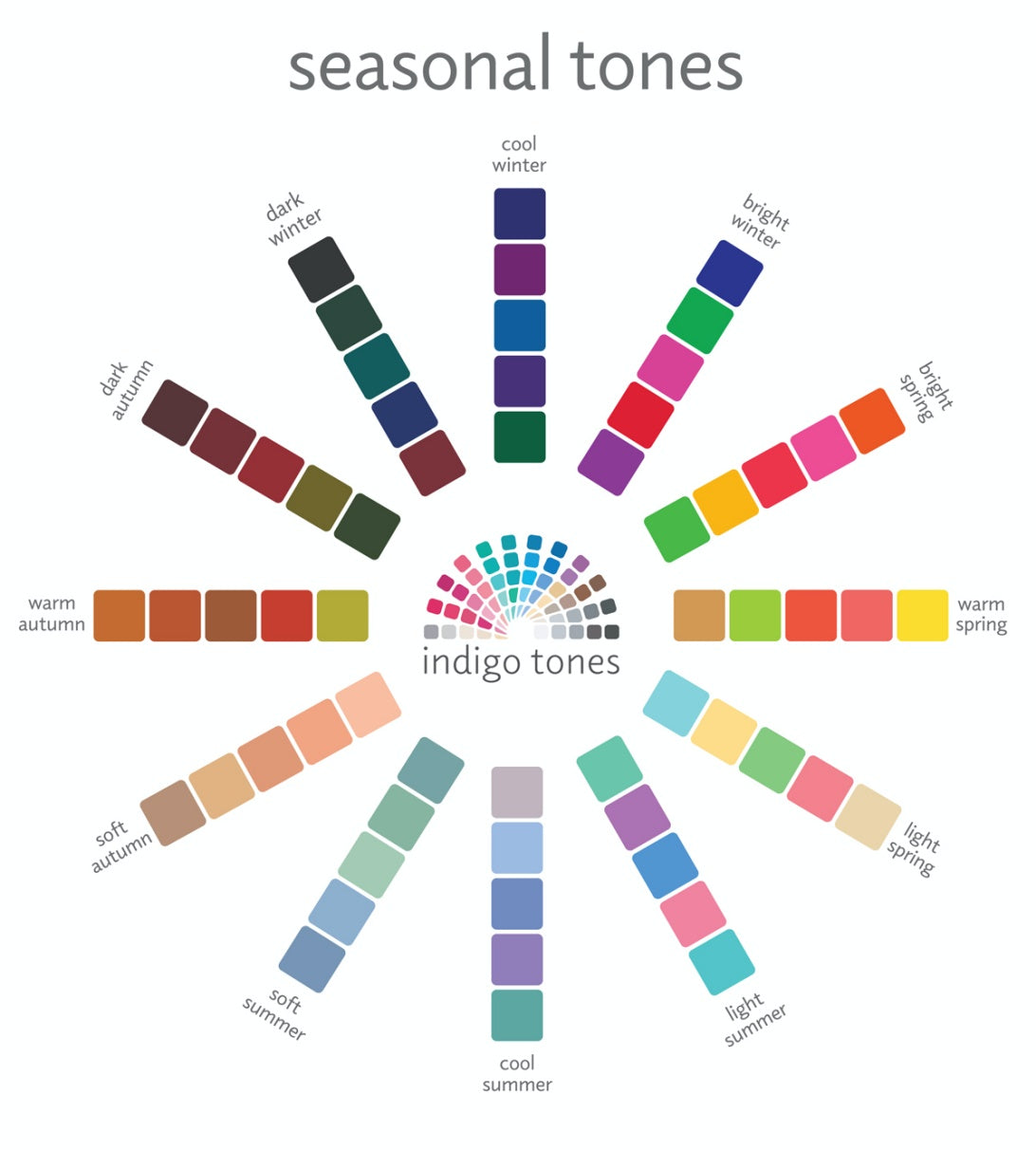

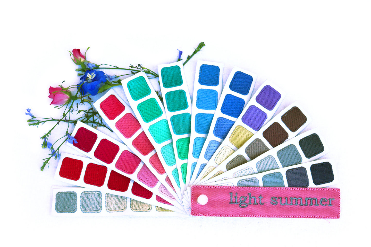
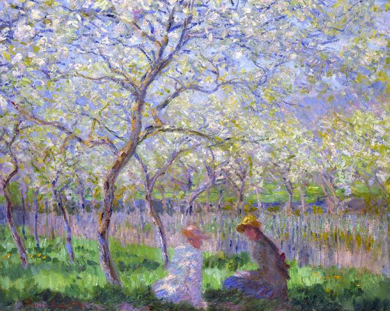
My students struggle the most in choosing color combinations that work, whether it’s with beads, stones, metals, or fibers. Using Kerry’s color swatch books would help them easily find color combinations that are harmonious and work best for them.
Susan, Jewelry Instructor