
Your Cart is Empty
You wouldn’t choose a shade of paint for your living room without consulting a swatch book of color samples, would you? You should also give your wardrobe the same level of consideration.
Once you complete your initial color analysis consultation, you’ll become the proud owner of your very own color swatch book. This handy tool, also sometimes called a color swatch palette or color wheel, fits easily in a purse or pocket and helps you identify your unique colors in clothing, fabric, paints, and more.
Using your swatch book might feel strange at first, but with a little practice, you’ll be able to pinpoint your signature shades in everything from t-shirts to hair color to wallpaper. The Indigo Tones Personal Color Plume© swatch book lets you shop confidently for clothing, accessories, cosmetics, hair color, and any time color choices are made. Read on to learn how to use your swatch book to build a coordinated, colorful wardrobe with total confidence.


Your goal is to curate a closet full of clothes you love, to have a few key accessories that let you pull multiple different outfits together, and to have a consolidated cosmetics bag with only the makeup that harmonizes with your skin tone.
Ideally, from now on, everything you purchase should align with the colors in your swatch book. These colors will automatically enrich the appearance of your skin tone, your natural hair color, and your eyes. In addition, it should reflect your unique style and fit your body’s shape.
Be patient. Try not to be overwhelmed by all you have learned about your coloring and color harmony. Don’t worry about the clothing items in your closet that aren’t quite right. A personal color consultation is about learning to make better choices for future purchases.
Once you learn how to use your color swatch book to find the colors that work best for you, this information will last a lifetime. But the process of creating a simplified, harmonious wardrobe takes time and commitment. Give yourself some space to become accustomed to getting to know the colors and shopping differently.
Take a look at a picture of my closet from just 10 years ago, and compare it to the photo I snapped this morning. Because I’ve curated only the shades and fabrics that work with my swatch book and style, it would be glaringly obvious if I tried to work in an item that didn’t quite fit. Once you get the hang of sticking to your colors, you’ll naturally gravitate toward the items you’ll love for the long term, and your wardrobe will start to take care of itself.

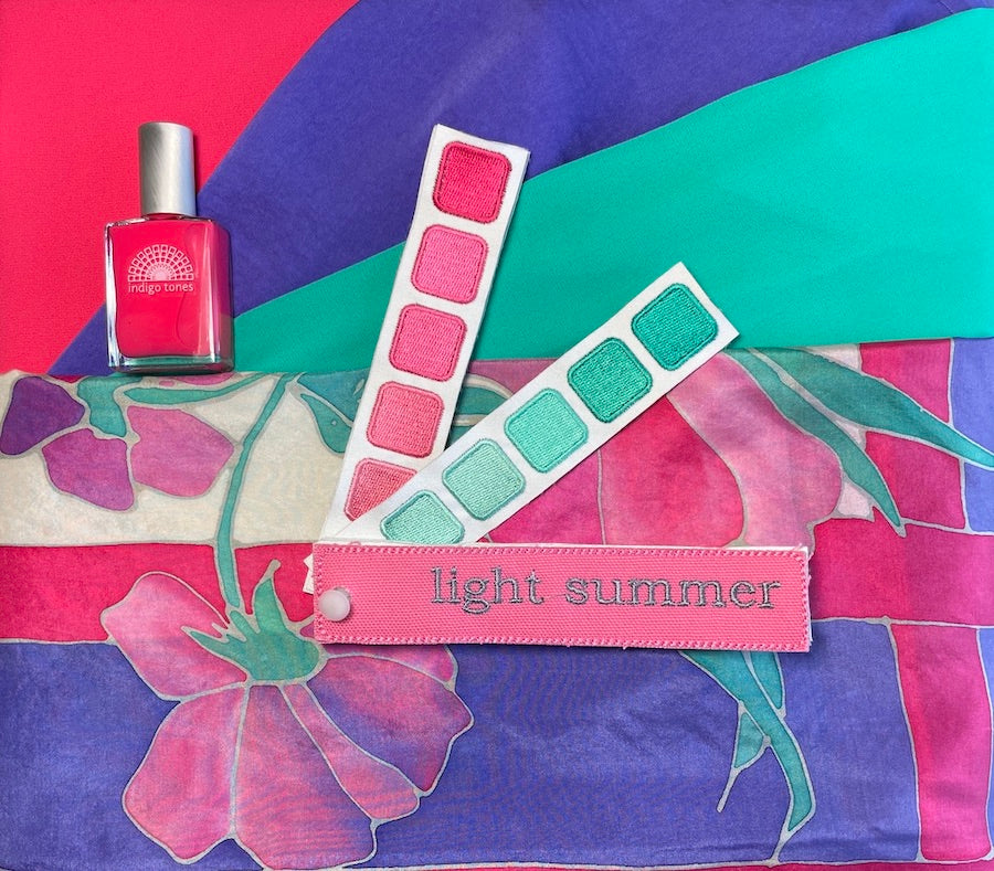
Your color swatch book is laid out in sections. Each color family is grouped together, usually moving from the lightest colors closest to the pin, out toward the darker colors at the top of each page. This matters when it comes to creating the right contrast that works with your seasonal tone. For example, soft seasons suit low contrast (think complementary shades of one color), while bright seasons suit higher contrast (think dark and light or bold color combos).

The cover page of your swatch book has the name of your seasonal tone harmony. It references a month of the year and reflects the vibe in the landscape that also harmonizes with your natural coloring. You should look to the natural world during that time for inspiration on how to wear your colors and what color names and colors will work best for you.
The first pages of the book are your neutrals. These are the colors found in your natural hair color and occasionally, your eyes. Your neutrals will be your versions of white and gray. For some, neutrals also include black, brown, taupe, cream, ivory, and so on. These shades will be the building block colors in your wardrobe. Your closet should have shoes, pants, skirts, belts, purses, coats and layering pieces in these colors. At least one quarter of your closet should be in these colors. (See my closet above for reference).
The last page represents your metallics. Reference these shiny shades when choosing jewelry, eyeglass frames, accent stitching, buckles, snaps, buttons, metallic clothing, and so on.
The pages in between are your color family groups. These are your versions of the basic color families: red, blue, yellow, green, purple, and orange. These colors are unique to your seasonal tone and don’t overlap with other seasons, although some may look similar to a season that has something in common with yours.
Some of the colors on the swatch book may appear to be the same color, but a closer look under natural lighting will show that they’re actually distinct shades. The more harmonious colors are to each other, the more they can resemble each other, creating a flow that is pleasing even to the most untrained eye.


A “match” should be an exact match, not “close". The colors on the swatch book and the color on the item (fabric, cosmetic, nail polish, yarn etc.) should literally bleed together when held next to each other. You shouldn’t be able to tell where one begins and the other ends. When there is harmony, the fabric might actually look like it matches several colors on the book. The color palette and the fabric create a oneness that feels right and unified.
Even a slight discrepancy can prevent the “magic” that color harmony can bring you. It is best to recheck the match in direct sunlight because the lighting in the typical store can be inadequate. If you find that the color doesn’t match don’t be afraid to return the item.
There are thousands of colors in the visible spectrum and the Personal Color Plumes© have been created to represent the essence of the seasonal tone with as much variety as possible. In order to be a useful tool for shopping, they represent variations of the key color families without being cumbersome.
There may be additional colors that when placed against the book as a whole are “accepted” by the other colors and create a unified feeling (like the above right pic) although they don’t perfectly match any one color. This gets easier to see with practice and by being persistent in getting exact matches early on. The more things you own that are just right, the more your will be able to see clearly what might also work or what is off.
To get a feel for where your current closet stands in relation to your ideal wardrobe, look at the items in your closet with your swatch book in hand.Pull out some of your favorite pieces and compare them to the colors in your book. If you find a match, that item would be a great starting point for collecting similar items in the future.
Hold on to anything in your closet that you absolutely love or has any of the three characteristics identified during your personal color analysis. These three dimensions of color are the guiding principles in creating color harmony in how you pull an outfit together, and what makes a good investment for your closet. Eliminate anything in your closet that is too far from your harmonious colors and you haven’t worn recently, or doesn’t fit properly.
Color trends come and go. Wearing only colors that suit you is economical and "trend-proof". Some years, you may not find your colors easily in stores, while other fashion seasons favor your colors and they are everywhere. That is when you might pick up many items all at the same time and stretch your budget if you can. Shopping resale is also a great strategy for finding style and colors that flatter you at reasonable prices, regardless of what is currently trending.
Try buying just a few inexpensive tops and wearing subtle makeup only in your colors. The feedback from family, friends, and strangers should start trickling in soon. Sometimes family members might need a little time to adjust to a big change, so be sure to be patient with them, too. But even without knowing what color harmony is, other people will start to take note of the effect it has on you right away.
Always take your swatch book with you when shopping. In the beginning, it might be hard to remember to bring your swatch book or to feel comfortable diligently identify exact color matches while in stores. Eventually it will become second nature. Give yourself some time to get used to looking for colors you may not have gravitated toward in the past. You could match the colors when you get home, but it helps to start using the swatch book as a tool when eyeing clothes, and getting a feel for exact matches. Without your swatch book on hand, finding clothing that works with your style can be frustrating and disappointing.
Be open to purchasing clothes when you see them if they are the right color, style and size, rather than frantically searching last minute for an upcoming event or specific need. When a piece is right, it will be worth the investment! Over time, you will have a thoughtfully curated wardrobe collection of pieces that complement you and each other.
Resist the temptation to purchase clothing because it’s on sale, because it’s a “close” match, or because you are frustrated and want to get something new in your closet.
It takes persistence to pull a wardrobe together that really works for you, but the simple, harmonious end result is well worth the wait!


Comments will be approved before showing up.

I had the pleasure of working with a Cool Winter client whose colors I had done many years ago. She had tried to shop for her colors but wasn't really motivated to stay true to them until more recently when she brought her daughter in for a color analysis and remembered the WOW when seeing someone draped in the perfect shades. Enjoy reading Julie's experience immediately following the closet color refresh and taking advice from Kerry about putting together outfits in a new way.

I am thrilled to introduce you to my friend, colleague and dreamwork mentor, Warm Spring Kristina Hutch Matthews. Kristina is an artist, writer, animal lover, healing arts practitioner and so much more! Her mother is also an accomplished and prolific artist and together they run the Penfield Arts Center.
We immediately clicked when we met and I was excited to give her a color analysis given her natural talent for all things aesthetic. I wasn't surprised to see her closet immediately following the analysis was filled with muted colors. That is typical these days, especially for those with a creative style. But, I was shocked to see her closet a few months ago. She has completely transformed it from the dusty colors of the past to lighter and brighter colors focused especially on the warmth of Warm Spring. She has learned that the golden browns of her hair and eyes work perfectly as neutrals replacing blacks and grays.
Over the years, I have utilized many personal development tools but it was Kristina's dreamwork class that has given me the most incredible AHA moments. I thought the class would be fun and interesting and help me understand why I saw a whale or something like that but dreamwork is so much more!! Kristina has a talent for giving feedback and fresh insight into a situation that may be challenging or lingering from the past. My understanding of how to remember and process dreams has truly been life changing and transformative. Kristina has brought so much color into my life! Read more about her journey with her artistry and healing practices as well as her personal color journey in this month's blog:

What fun to introduce the incredibly colorful Bright Spring, Natalie Rae Dickerson! I met Natalie when she was in the process of taking over the fabulous fine clothing store, Panache Consignment from my client and colleague Joan Lincoln. Meeting Natalie was like a burst of fresh air. She radiated warmth and vibrancy and was very game to learn more about what colors would be ideal for her. It was no surprise that she absolutely popped in the bright colors and that she jumped right in head first into wearing them. Every time I pop in to the shop, she is shining in some new combination of her colors. She redesigned the store to be organized by color and I find it so easy to find colors for myself and my clients. Read more about her international journey in the world of fashion and color in this month's blog.
Would you like to receive updates about Indigo Tones products, services, travel schedule and interesting features on color? Subscribe today!


Evie Douglas
March 09, 2022
Thoroughly enjoyed our joint consultation with you this week! Learned so much and even used my swatch pallet to purchase two perfectly matched tops (plum sweater, teal shirt) at Lily’s consignment in Canandaigua. I’m looking forward to sorting out my closet during the up and coming snow storm! Happy travels to you!