Your Cart is Empty
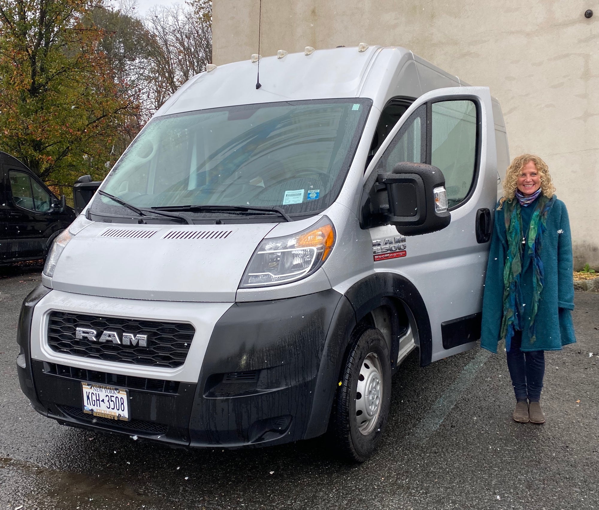
I am thrilled to announce that I will be hitting the road in 2021 with an Indigo Tones traveling studio! For years, clients all over the country have been asking me to come to them to perform color analysis plus host workshops and seminars. When the events of the past year limited the ability to travel freely and safely, I realized this was the time to finally make it happen.
The first destination is Florida in March and April of 2021. I will be performing color analysis from the traveling van or I can come to your location, if appropriate. The travel schedule will be available on the website and social media so please follow Indigo Tones on Instagram and Facebook. I will also share my adventures via vlog, so be sure to subscribe to Indigo Tones on Youtube and share in the fun. All requests will be considered no matter the location but those involving larger groups will be my first priority.
While the traveling van affords me new opportunities to bring services and products directly to you, I still have a stationary studio. I have moved it from Pittsford, NY into the city of Rochester, NY. It is ten minutes from the airport and nestled in the heart of the Neighborhood of the Arts. It is walking distance to shops, restaurants, cafes and museums. When you visit, I hope you feel the same energy and excitement that I do and share my love for color!
So, are you ready to jump on board in 2021? I am delighted to offer both options for color analysis--on the road or in my Rochester studio. I can't wait to meet new people who want to learn the benefits of wearing colors that enhance their natural appearance.
Click here to schedule a color analysis in Rochester or request that I come to your city!
Comments will be approved before showing up.

I had the pleasure of working with a Cool Winter client whose colors I had done many years ago. She had tried to shop for her colors but wasn't really motivated to stay true to them until more recently when she brought her daughter in for a color analysis and remembered the WOW when seeing someone draped in the perfect shades. Enjoy reading Julie's experience immediately following the closet color refresh and taking advice from Kerry about putting together outfits in a new way.

I am thrilled to introduce you to my friend, colleague and dreamwork mentor, Warm Spring Kristina Hutch Matthews. Kristina is an artist, writer, animal lover, healing arts practitioner and so much more! Her mother is also an accomplished and prolific artist and together they run the Penfield Arts Center.
We immediately clicked when we met and I was excited to give her a color analysis given her natural talent for all things aesthetic. I wasn't surprised to see her closet immediately following the analysis was filled with muted colors. That is typical these days, especially for those with a creative style. But, I was shocked to see her closet a few months ago. She has completely transformed it from the dusty colors of the past to lighter and brighter colors focused especially on the warmth of Warm Spring. She has learned that the golden browns of her hair and eyes work perfectly as neutrals replacing blacks and grays.
Over the years, I have utilized many personal development tools but it was Kristina's dreamwork class that has given me the most incredible AHA moments. I thought the class would be fun and interesting and help me understand why I saw a whale or something like that but dreamwork is so much more!! Kristina has a talent for giving feedback and fresh insight into a situation that may be challenging or lingering from the past. My understanding of how to remember and process dreams has truly been life changing and transformative. Kristina has brought so much color into my life! Read more about her journey with her artistry and healing practices as well as her personal color journey in this month's blog:

What fun to introduce the incredibly colorful Bright Spring, Natalie Rae Dickerson! I met Natalie when she was in the process of taking over the fabulous fine clothing store, Panache Consignment from my client and colleague Joan Lincoln. Meeting Natalie was like a burst of fresh air. She radiated warmth and vibrancy and was very game to learn more about what colors would be ideal for her. It was no surprise that she absolutely popped in the bright colors and that she jumped right in head first into wearing them. Every time I pop in to the shop, she is shining in some new combination of her colors. She redesigned the store to be organized by color and I find it so easy to find colors for myself and my clients. Read more about her international journey in the world of fashion and color in this month's blog.
Would you like to receive updates about Indigo Tones products, services, travel schedule and interesting features on color? Subscribe today!