Your Cart is Empty
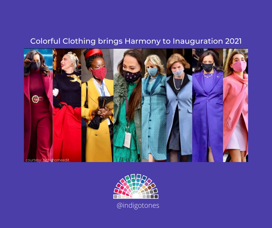
Color is important and Inauguration Day 2021 illustrated in living color how effective it can be to convey a clear and dramatic message. It was a gorgeous color-soaked event. What a thrill it was to see beautiful, accomplished women of many complexions radiating by wearing COLOR. Watching the coverage was like staring in awe at a masterpiece painting. As it played out it seemed as if the individual elements were all in perfect balance with each other.
Early in the morning on Inauguration Day I posted a definition of harmony on social media not knowing that I would soon be seeing it unfold in front of my eyes. Harmony is defined as an orderly and pleasing combination of parts creating a consistent and more pleasing “whole”. I specialize in personal color harmony but know that the same concepts that bring a person in harmony with what they wear are also desirable in creating harmony in all aspects of our lives. When each of us shines in our own unique way, the whole actually unifies and becomes better, enhancing the individual and the whole at the same time.
Each of the key female figures at the Inauguration looked stunning in their color and style choice. The monochromatic scheme was dramatic and effective. The clothing and color suited their roles and reflected their unique personality styles. This brought a balanced and unified look to the “whole”.
Jill Biden’s teal blue suit balanced her lighter, softer coloring and personality. It felt right for her role as the new First Lady. The more muted blue stood in subtle balanced contrast to Kamala Harris’s rich jewel tone blue. This color reflected the strength of Kamala’s personality. She brought additional meaning to her style by continuing the tradition of wearing her signature pearls. This is a ritual for honoring the pioneers who established her sorority, Alpha Kappa Alpha, for women of color.
The President's granddaughters, Finnegan and Natalie Biden chose a soft salmon and a light pink. For women with softer or lighter coloring, a choice in those colors will actually empower them. A bold color would not have enhanced their looks. It would have overpowered them. Both women were able to stand out without wearing strong colors. Michelle Obama was understated but radiant in her deep elegant red. It was a very appropriate choice for a former first lady and a woman with deep tones in her hair, eyes and skin. She appeared to be a calming mentor who showed up without overshadowing “the others” or fading into the background.
The shining star was the exceptionally radiant Poet Laureate, Amanda Gorman! Her powerful delivery was perfectly balanced with the bright bold yellow and contrasting red in her outfit. Her stylish overcoat and signature head band added to her shiny accessories and it was impossible to ignore her presence in any way. Our eyes were drawn to look at her while our ears hungered to hear her words. She orchestrated a perfectly choreographed appearance and performance with the polish of an art director. She was her own true masterpiece.
Each of these women illustrated how wearing color and styles with confidence and honoring yourself in your role not only allows you to stand out but creates a pleasing ensemble.
Could we be entering an era where we celebrate, elevate, and honor the power of color? Maybe the world is ready to embrace our individuality and create a more unified, complementary and harmonious “whole”. I can’t wait.
Kerry Jones, Personal Color Analyst
indigotones.com | @indigotones
photo credit: @thehomeedit
Comments will be approved before showing up.

I had the pleasure of working with a Cool Winter client whose colors I had done many years ago. She had tried to shop for her colors but wasn't really motivated to stay true to them until more recently when she brought her daughter in for a color analysis and remembered the WOW when seeing someone draped in the perfect shades. Enjoy reading Julie's experience immediately following the closet color refresh and taking advice from Kerry about putting together outfits in a new way.

I am thrilled to introduce you to my friend, colleague and dreamwork mentor, Warm Spring Kristina Hutch Matthews. Kristina is an artist, writer, animal lover, healing arts practitioner and so much more! Her mother is also an accomplished and prolific artist and together they run the Penfield Arts Center.
We immediately clicked when we met and I was excited to give her a color analysis given her natural talent for all things aesthetic. I wasn't surprised to see her closet immediately following the analysis was filled with muted colors. That is typical these days, especially for those with a creative style. But, I was shocked to see her closet a few months ago. She has completely transformed it from the dusty colors of the past to lighter and brighter colors focused especially on the warmth of Warm Spring. She has learned that the golden browns of her hair and eyes work perfectly as neutrals replacing blacks and grays.
Over the years, I have utilized many personal development tools but it was Kristina's dreamwork class that has given me the most incredible AHA moments. I thought the class would be fun and interesting and help me understand why I saw a whale or something like that but dreamwork is so much more!! Kristina has a talent for giving feedback and fresh insight into a situation that may be challenging or lingering from the past. My understanding of how to remember and process dreams has truly been life changing and transformative. Kristina has brought so much color into my life! Read more about her journey with her artistry and healing practices as well as her personal color journey in this month's blog:

What fun to introduce the incredibly colorful Bright Spring, Natalie Rae Dickerson! I met Natalie when she was in the process of taking over the fabulous fine clothing store, Panache Consignment from my client and colleague Joan Lincoln. Meeting Natalie was like a burst of fresh air. She radiated warmth and vibrancy and was very game to learn more about what colors would be ideal for her. It was no surprise that she absolutely popped in the bright colors and that she jumped right in head first into wearing them. Every time I pop in to the shop, she is shining in some new combination of her colors. She redesigned the store to be organized by color and I find it so easy to find colors for myself and my clients. Read more about her international journey in the world of fashion and color in this month's blog.
Would you like to receive updates about Indigo Tones products, services, travel schedule and interesting features on color? Subscribe today!