
Your Cart is Empty

- Home
- Color Analysis
- Shop
- Services
- PCA Consultation
- PCA Refresher Consultation
- Travel PCA Consultation in your city
- Image & Wardrobe Consultation
- Colorful Capsule Wardrobe Package
- Colorful Clutter Free Bedroom Package
- Speaking & Presentation
- Wedding Colors Consultation
- Interior Design Consultation
- Color Harmony Tools
- Services Available Virtually
- Drapes
- Training
- Blog
- About


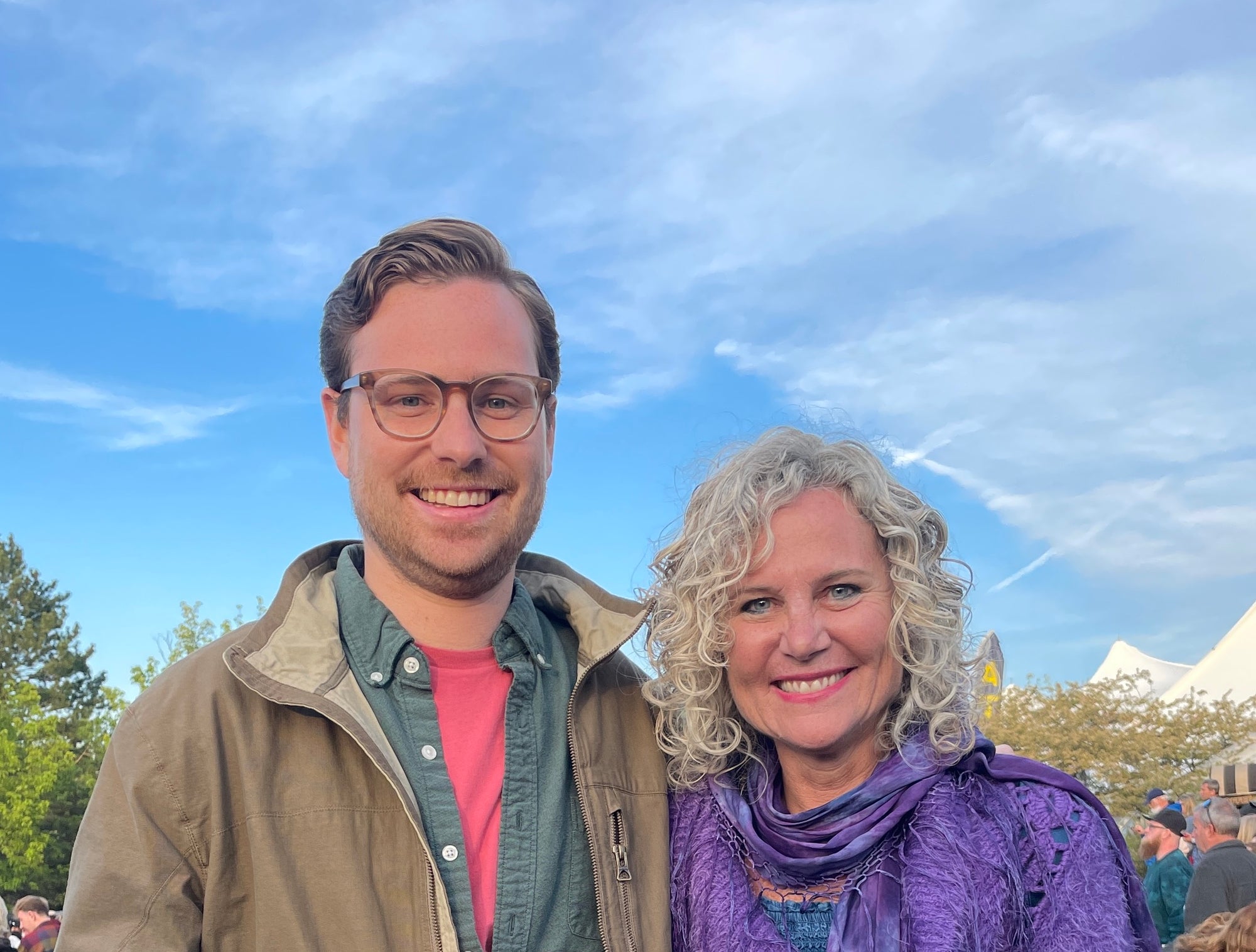

Evie Douglas
March 09, 2022
Thoroughly enjoyed our joint consultation with you this week! Learned so much and even used my swatch pallet to purchase two perfectly matched tops (plum sweater, teal shirt) at Lily’s consignment in Canandaigua. I’m looking forward to sorting out my closet during the up and coming snow storm! Happy travels to you!